If you haven’t heard webmasters and SEOs somewhat losing their shiz about this big new thing called mobile-first index, you haven’t been paying attention.
It’s kind of a big deal. Let’s talk about why (and when its big deal-ness is going to hit us full on in the face), what it means for us, and what we can do to prepare. (Hint: it’s not curl up in a ball and cry in a corner, shouting OKAY TECHNOLOGY YOU CAN STOP CHANGING NOW.)
Right after we explain just what the heck this thing is.
What Is a Mobile-First Index?
I understand I might be speaking to a room full of SEOs here, but we’re going to take it one simple step at a time just to make sure even the least experienced among us gets the gist.
Okay, so. You know how Google indexes, or kind of catalogues, every webpage on the internet? (Meaning, they crawl every site for info on what’s on it so they can display it in the most helpful order to search engine users.)
Well, currently, and since pretty much the beginning of search, Google uses the desktop versions of websites for this indexing process. This means 2 important things:
- You can do these fancy things to help boost mobile SEO, and you can do these fancy things to help boost regular ole desktop SEO, but for the most part, it’s the SEO of the whole shebang of your website (the home base, the desktop version) that dictates where you’ll end up on SERPs first.
- You could have an absolute shitstorm of a mobile site, but a superbly optimized desktop site, and end up higher than on mobile SERPs than others just because, overall, your desktop SEO game is good enough to keep you afloat.
See how that’s not quite fair? Someone with killer mobile SEO game could be outranked on a mobile SERP by someone with lackluster mobile SEO game just because their desktop SEO is so good, and that’s the version of the site Google is using to make the calls first.
It’s not quite fair to the site owner with the nicely optimized mobile site, but you know who it’s the worst for? Probably the customer. The web result that will give them more information, and is more optimized to help them, gets pushed down simply because someone else was better at making a website that looks good on some other device in who-gives-a-crap land.
SO. You see how Google might be a little, “Hmmm, that’s a sticky situation,” about all of this. That’s why they’ll be rolling out the mobile-first index soon.
It’s just like I described it above with the index thing, about how Google crawls sites so they can decide where to place them on SERPs. Except the big, huge difference is that Google will crawl mobile sites first instead of the desktop ones. Meaning mobile SEO will carry much greater weight than it does now. Meaning that they’re not screwing around when they say they want their users’ mobile experiences to be efficient.
To put it simply, Google is currently crawling desktop versions of site first and the mobile versions second. Fancy algorithms will mush these 2 gauges of “how good of a search result are you” into one spot onto an SERP.
And to put the change we’re looking at now, simply: they’re switching those 2 processes around. Mobile first. Desktop, second. Yowza, that’s a big one.
Here’s What Else We Know About Google’s Mobile-First Index

Gary Illyes at Search Engine Land’s SMX Advanced Conference in Seattle, June 2017. From searchengineland.com.
Gary Illyes from Google has been chattin’ up a storm about mobile-first at conferences and to reporters and such. But when Gary was most recently asked (in April) when this thing was actually going to, you know, roll out, and is it possible we’ll see the switch by the end of 2017? He just kind of shrugged his shoulders and was like, “Hmm, prolly not.”
The team doesn’t have any hard timelines, and it sounds like they’re more focused on getting it right than getting it rolled out ASAP.
There’s not a ton of info on the switch right now, but it’s safe to say we’ll see it sometime in 2018. It sounds like, if anything, the team leading the charge might roll out a beta version before the end of the year. But the normies like us won’t see the likes of it until months later.
So that’s our when—if you can call a 365-day-long window a when. (Detective Tim, at your service.)
What about the why?
Above all, Google wants to organize the world’s information for the best search experience there is. And to make money doing it, obviously.
So when, 2 years ago, mobile search outnumbered desktop searches for the first time ever, Google was probably like, hmm, that seems important.
After all, if most people are searching on their phones, why give them SERPs full of results mostly based on how well the sites have been optimized…on a totally different device?
When mobile SERPs are dictated this way, the searcher is most likely stuck with a stripped-down version of the site they’re looking for, possibly less equipped to meet their needs than a site that fell to the next page just because its desktop SEO wasn’t as good.
What It Means For You
Okay, so that’s great and all for the searcher, I guess. I mean GOD, it’s like we do everything for them.
What about us? Let’s try to predict what will change and how we can straddle these changes and use ‘em to make it easier for our dream customers to find us.
What Will Change?
Everything. It’s all going to fall apart. We should all just get out of the game now.
Just kidding—it really will be fine. Here are some of my predictions on how this big change will impact us.
It will only affect your rankings if your web and mobile site versions are super different.
Google is mostly concerned with websites adhering to the “bare minimum” of mobile friendliness, and chances are—if you’ve given even an ounce of a crap about your mobile strategy in your SEO strategy—you’ll be just fine.
This is just another move in Google’s big over-arching strategy to make mobile as user-friendly as possible—and there will be more.
It falls in step with past initiatives like AMPs and penalization for intrusive interstitials: it’s all about making browsing on the small screen easier.
Don’t get too comfy, and don’t expect this to be Google’s last big change towards mobile accessibility. Stuff like this will keep happening, so keep your eyes, ears, and mind open.
And, speaking of intrusive interstitials…
Penalization for big, loud, and clunky ads on mobile will only get worse.
If your ads are making it tough for the mobile visitor to your site, fix it now. Don’t wait for Google’s penalizations to get worse; don’t wait until you fall 2 pages in the SERPs.
There’s a classy way to do mobile ads, and Google is becoming less and less tolerant of the classless.
Overall, what I’m saying is this: we can argue over Google’s intentions and implementations, and we can complain that they’re creating more work for us and making it harder to rank.
Or we can just nod our heads, say, “I guess I see where you’re coming from,” and just do the damn thing—make the changes we need to make to ensure we’re still getting found by the right people.
How to Prepare
Here are some changes I recommend you make—some checks to do to see whether or not mobile-first will affect you. (Google has their own helpful advice here.)
Content
Not having all the content available to your mobile users that you have to your desktop users is no bueno. If you’ve shed your content in your quest to keep mobile simple, you’re going to have to rethink your strategy. If you continue to leave your content (blog posts, inventory, videos) out of your mobile site, you will be penalized by the new mobile-first structure.
Even if you have to put it behind a “Read more” button or find some other tucked-away approach to do it, get that content in there.
Structured Data
You know, schema markup? The stuff that tells search engines what’s what? (It’s the thing that tells search engines that you have a star rating, or a brick-and-mortar address, or a meta description of what your site’s all about.)
You’re going to want to make sure that’s on your mobile site, too. Google is helpful enough to provide their own structured data markup helper; hopefully they’ll enable this tool for mobile by the time the switch is made.
Site Navigation
Look, I get it. You have a lot of stuff in your menu bar. Drop-downs and such.
And maybe you don’t want to put all of that on your mobile site’s homepage because it looks a bit…cluttery.
But now, you kind of have to. Unless you want your SEO to suffer.
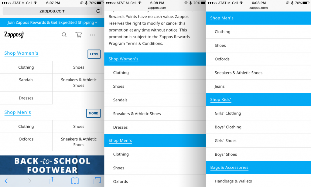
There’s clean ways to do it, like having a menu tab that toggles open and shut from the side or putting the main menu sections at the top while including the less important subsections at the bottom. You might have to get creative, but you’d do well to figure it out now instead of waiting until mobile-first makes it a must.

Zappos’s desktop site has a ton of menu items. And we’re like, oh no, how will they do it? From zappos.com.

Ah, yes—they’ve got it figured out nicely. Their (assumedly) top grossing departments are still listed at the top (pane 1), and the rest of the menu continues on under the body section of the home page (panes 2 and 3). From m.zappos.com.
Page Speed
Page speed is always important, but it might become even more important after the mobile-index switch. After all, aren’t Google’s algorithms designed to reward those sites who provide the most efficient and enjoyable experience for their users?
So be fast, on desktop and especially on mobile. Try Google’s PageSpeed Insights tool.
How NOT to Prepare for Google Mobile-First Index
Basically, don’t freak out. We have time. (Remember that super helpful 365-day window I gave earlier?)
We can’t say we didn’t have plenty of warning on this one and plenty of time to prepare. And Google’s even offering us advice on what to do (see it again here) because they want to see us succeed. When we do, they do, and customers have a nice time, too, and everyone’s just happy.
Personally, I think it’s great that Google is rewarding those who do the most to make their customers’ experiences enjoyable. So let’s try to remember: this is a good thing. Even if it’s making us do a bit more up-front work. Let’s get to writing that “Prepping for Mobile-First” to-do list and start checking things off, one by one.


